Why Fall Protection?
For Roofers – falls are the number one cause of serious physical injury and death. There have been many different opportunities for workers to fall off roofs – be it roof edges, ladders, open holes, sky lights.
Over 70% of deaths in the roofing industry have been caused by falls. These were largely a result of not using any means of fall prevention for workers.
New Fall Protection Regulations Governing Residential Roofing Contractors go into effect December 15, 2012.
Once a fall begins – it is virtually impossible to stop the fall yourself. It is impossible due to one of the unbending laws of physics – gravity.

Typical human reaction time is about ½ second - even in this short time, the distance and forces accumulated are considerable!
In .5 seconds you will fall roughly 4 feet and the force on impact (if you struck the ground) would be 3,200Lbs! There is no way a human can recover and self-arrest a fall when acting against these forces.
Let’s look at a chart of Fall Distance vs Arresting Force on Impact for 200 pound roofer.
Fall Distance Time Arresting Force7.6” .10 sec 512 lbs
17” .30 sec 1,152 lbs
31” .40 sec 2,048 lbs
4 feet .50 sec 3,200 lbs
6 feet .62 sec 4,800 lbs
8 feet .71 sec 6,400 lbs
10 feet .79 sec 8,000 lbs
As your fall progresses, the speed at which you fall increases as does the forces of impact that will be exerted upon you when you hit the ground.
You will only stop when you hit a lower surface – be it the ground or another roof/vehicle etc.
Showing posts with label OSHA. Show all posts
Tuesday, November 27, 2012
Tuesday, March 6, 2012
Emergency Symbol Recognition
Emergency Symbol Comprehension
ICE4SAFETY’s trademarked emergency icon was created in 2005 by safety professionals wanting a “Best Practice” highly recognizable and memorable symbol to represent emergency preparedness.
This is especially important for our highly diverse as well as our aging members of society who may find some of the new safety symbology confusing.
We believe we created a very useful and easy to understand representative safety icon and here is the short form reasons why:
1. Symbols should be visually simple & representational. Simple and direct is best.
ICE symbol is comprised of bonified safety colors (Orange, Blue with White lettering) found on OSHA/ANSI signage. ICE represents medical emergency preparedness and reflects the extensively used NHTSA “Star of Life”. ICE = In Case of Emergency.
Independent study has shown that the term “ICE” is widely recognized by the majority of American citizenry. The concept continues to get coverage in the national media. For those who may not be immediately cognizant of the symbol’s meaning it is a simple and easy task to understand and recall in an emergency situation.
2. Increased Complexity should be relevant and necessary in communicating the symbol’s meaning.
We kept the symbol simple. One need only recall that ICE and Emergency are synonymous.
Text denoting ICE is in plain sight – not obscured by any other symbology, notices, graphics or distracting irrelevant terms such as advertising.
In fact any such sponsorship of the printing of ICE images is relegated to one line (only) of non-distracting text on the bottommost edge of the symbol. Creations of promotional materials for community groups or EMS/Fire is strictly that – promotional. Actual use materials are strictly function oriented. Once again KISS.
3. Symbols should not be arbitrary if they are abstract.
The six bars of the NHTSA Star of Life and safety color scheme are representative of safety in all sectors of our society and have been for decades.
4. Using abstract or arbitrary symbols – using contextual or verbal cues in design may facilitate initial symbol comprehension and increase training effectiveness.
Training and awareness “uptake” for the ICE symbol representing emergency preparedness, workplace safety, emergency medical-contact and related safety/preparedness uses rapid and long term. We advocate KISS and REDUNDANCY as prime concepts of preparedness. The use of “ICE” is promoted for cell phone use and is incorporated in phone design and as an ITU international communication standard E.123 that electronic devices are programmed to recognize by design.
5. “Learnability” can aid in selection of the best symbol from a set of symbols of similar comprehensibility.
One need only review a list of the various symbols used on jobsites and workplaces to see there are conflicting and confusing symbols that can be misunderstood. Not with ICE.
Learning what ICE represents can be as easy as one 5 second training at a visitor station at any hospital, workplace, business, school, vehicle safety, government facility or home. It IS that simple. A doctoral study in hospitals in Amsterdam has shown that even an uninformed medical professional easily comprehends ICE and immediately agrees to the use of this term and the concept of preparedness that is represented.
ICE4SAFETY appreciates the support ICE has received and for the continued interest and use in community safety programs.
Recommendations for symbol design were adapted from an article by fellow ASSE members in the March 2012 Professional Safety Magazine - The Aging Workforce by Mary F. Lesch, William J. Horrey, W. Ryn Powell and Michael Wogalter. Page 45-49 www.asse.org
ICE4SAFETY’s trademarked emergency icon was created in 2005 by safety professionals wanting a “Best Practice” highly recognizable and memorable symbol to represent emergency preparedness.
This is especially important for our highly diverse as well as our aging members of society who may find some of the new safety symbology confusing.
We believe we created a very useful and easy to understand representative safety icon and here is the short form reasons why:
1. Symbols should be visually simple & representational. Simple and direct is best.
ICE symbol is comprised of bonified safety colors (Orange, Blue with White lettering) found on OSHA/ANSI signage. ICE represents medical emergency preparedness and reflects the extensively used NHTSA “Star of Life”. ICE = In Case of Emergency.
Independent study has shown that the term “ICE” is widely recognized by the majority of American citizenry. The concept continues to get coverage in the national media. For those who may not be immediately cognizant of the symbol’s meaning it is a simple and easy task to understand and recall in an emergency situation.
2. Increased Complexity should be relevant and necessary in communicating the symbol’s meaning.
We kept the symbol simple. One need only recall that ICE and Emergency are synonymous.
Text denoting ICE is in plain sight – not obscured by any other symbology, notices, graphics or distracting irrelevant terms such as advertising.
In fact any such sponsorship of the printing of ICE images is relegated to one line (only) of non-distracting text on the bottommost edge of the symbol. Creations of promotional materials for community groups or EMS/Fire is strictly that – promotional. Actual use materials are strictly function oriented. Once again KISS.
3. Symbols should not be arbitrary if they are abstract.
The six bars of the NHTSA Star of Life and safety color scheme are representative of safety in all sectors of our society and have been for decades.
4. Using abstract or arbitrary symbols – using contextual or verbal cues in design may facilitate initial symbol comprehension and increase training effectiveness.
Training and awareness “uptake” for the ICE symbol representing emergency preparedness, workplace safety, emergency medical-contact and related safety/preparedness uses rapid and long term. We advocate KISS and REDUNDANCY as prime concepts of preparedness. The use of “ICE” is promoted for cell phone use and is incorporated in phone design and as an ITU international communication standard E.123 that electronic devices are programmed to recognize by design.
5. “Learnability” can aid in selection of the best symbol from a set of symbols of similar comprehensibility.
One need only review a list of the various symbols used on jobsites and workplaces to see there are conflicting and confusing symbols that can be misunderstood. Not with ICE.
Learning what ICE represents can be as easy as one 5 second training at a visitor station at any hospital, workplace, business, school, vehicle safety, government facility or home. It IS that simple. A doctoral study in hospitals in Amsterdam has shown that even an uninformed medical professional easily comprehends ICE and immediately agrees to the use of this term and the concept of preparedness that is represented.
ICE4SAFETY appreciates the support ICE has received and for the continued interest and use in community safety programs.
Recommendations for symbol design were adapted from an article by fellow ASSE members in the March 2012 Professional Safety Magazine - The Aging Workforce by Mary F. Lesch, William J. Horrey, W. Ryn Powell and Michael Wogalter. Page 45-49 www.asse.org
Tuesday, September 14, 2010
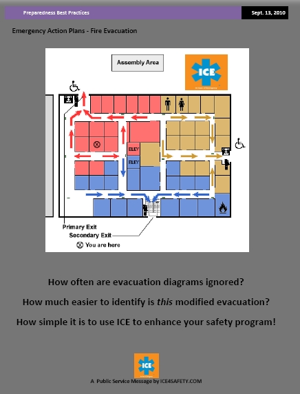
Emergency Action Plans - Evacuation
OSHA tries to simplify the process and we blogged about that previously here.
As a component part of your company or organization's Emergency Action Plan you can use ICE as a tool to help immediately identify any/all documents, information, routes and pertinent equipment or resources using this simplified method.
Does your facility receive visitors? If so how do you orient them to the safety and evacuation procedures ? How do you handle subcontractors with new employees? Short term visitors?
You are likely going to say they are escorted around the facility right? When that system breaks down are you visitors left to their own devices? Orienting visitors upon their signing in can take from less than a minute to five minutes in many cases and is considerably more beneficial than if you did nothing.
ICE can be a cohesive and consistent identifying symbol of safety and preparedness in your facility - and elsewhere.
Try it out - overcome complacency. See our file uploads on Twitter as well.....
Visit: www.ice4safety.com
Thursday, May 22, 2008
ICE and Workplace Safety
ICE has proven to be quite an attention grabber when it comes to safety - and for good reason. The particular design employed by ICE4SAFETY is one that was not designed on a whim. The three colors used by the design are there for a reason.
Three color schemes improve visibility and recognition significantly. (Did you fail to see the FedEx truck going down the road - not likely.)
Costs for printing three color schemes are higher and worth it if it improves recognition - cuttings costs with safety usually means someone loses - but people continue to do it because they think they are saving money.
If you are of the mindset that you need to camouflage your safety presence for some arcane reason, then don't consider this symbol for safety!
There is NO mistaking the high visibility ICE symbol used here. It was designed by people in the safety business.
ICE4SAFETY along with a number of other safety organizations and private companies has approached OSHA to introduce the concept of ICE into the workplace because it uniquely compliments the workplace requirements for Emergency Action Planning (EAP) as prescribed by 29 CFR 1910.38(a) for General Industry and 29 CFR 1926.35 for the Construction Industry.
You can review some of the initial documents and ideas created for this Alliance with OSHA at the ICE Website . A slide show has been created for your convenience and it will be updated as the project evolves.
The basic premise behind the workplace safety initiative is that workers and employers to have a high profile- easily understood and representative symbol that can be employed on any job site or workplace representing what to do in an emergency. There is no reason why such a widely recognized symbol in everyday life should not be utilized to help industry more easily comply with federal workplace safety rules. Simple.
Subscribe to:
Posts (Atom)