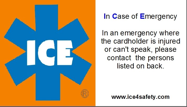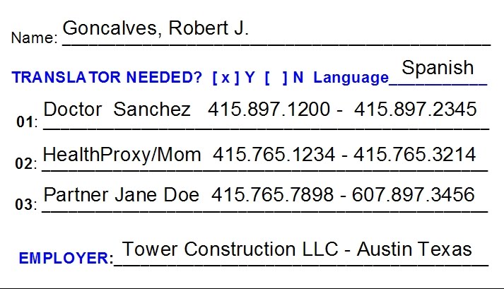
ICE4SAFETY’s trademarked emergency icon was created in 2005 by safety professionals wanting a “Best Practice” highly recognizable and memorable symbol to represent emergency preparedness.
This is especially important for our highly diverse as well as our aging members of society who may find some of the new safety symbology confusing.
We believe we created a very useful and easy to understand representative safety icon and here is the short form reasons why:
1. Symbols should be visually simple & representational. Simple and direct is best.
ICE symbol is comprised of bonified safety colors (Orange, Blue with White lettering) found on OSHA/ANSI signage. ICE represents medical emergency preparedness and reflects the extensively used NHTSA “Star of Life”. ICE = In Case of Emergency.
Independent study has shown that the term “ICE” is widely recognized by the majority of American citizenry. The concept continues to get coverage in the national media. For those who may not be immediately cognizant of the symbol’s meaning it is a simple and easy task to understand and recall in an emergency situation.
2. Increased Complexity should be relevant and necessary in communicating the symbol’s meaning.
We kept the symbol simple. One need only recall that ICE and Emergency are synonymous.
Text denoting ICE is in plain sight – not obscured by any other symbology, notices, graphics or distracting irrelevant terms such as advertising.
In fact any such sponsorship of the printing of ICE images is relegated to one line (only) of non-distracting text on the bottommost edge of the symbol. Creations of promotional materials for community groups or EMS/Fire is strictly that – promotional. Actual use materials are strictly function oriented. Once again KISS.
3. Symbols should not be arbitrary if they are abstract.
The six bars of the NHTSA Star of Life and safety color scheme are representative of safety in all sectors of our society and have been for decades.
4. Using abstract or arbitrary symbols – using contextual or verbal cues in design may facilitate initial symbol comprehension and increase training effectiveness.
Training and awareness “uptake” for the ICE symbol representing emergency preparedness, workplace safety, emergency medical-contact and related safety/preparedness uses rapid and long term. We advocate KISS and REDUNDANCY as prime concepts of preparedness. The use of “ICE” is promoted for cell phone use and is incorporated in phone design and as an ITU international communication standard E.123 that electronic devices are programmed to recognize by design.
5. “Learnability” can aid in selection of the best symbol from a set of symbols of similar comprehensibility.
One need only review a list of the various symbols used on jobsites and workplaces to see there are conflicting and confusing symbols that can be misunderstood. Not with ICE.
Learning what ICE represents can be as easy as one 5 second training at a visitor station at any hospital, workplace, business, school, vehicle safety, government facility or home. It IS that simple. A doctoral study in hospitals in Amsterdam has shown that even an uninformed medical professional easily comprehends ICE and immediately agrees to the use of this term and the concept of preparedness that is represented.
ICE4SAFETY appreciates the support ICE has received and for the continued interest and use in community safety programs.
Recommendations for symbol design were adapted from an article by fellow ASSE members in the March 2012 Professional Safety Magazine - The Aging Workforce by Mary F. Lesch, William J. Horrey, W. Ryn Powell and Michael Wogalter. Page 45-49 www.asse.org